What is a portrait? Generally, a portrait is defined as a visual representation of a specific individual, and typically takes the form of a drawing, a painting, or a photograph. Nowadays we are more familiar with portrait photography, but for most of history, paintings were the preferred means of capturing a person’s likeness. Painted portraits have been used to immortalize significant figures in society— politicians, war heroes, high-ranking members of the church, the wealthy elite, etc. Over time, portraits became more accessible to people as the middle class evolved. Along with this change came a new purpose for portraiture, which is to preserve the likeness, memories and accomplishments of private individuals for use in their own homes. And currently, anyone and everyone can have a portrait of their own, whether it’s done traditionally, digitally, or through photography.
Perhaps one of the strongest aspects of portraiture in general is the fact that it is not only a picture of a person— it is also a means of storytelling. One can learn quite a bit about the subject based on the environment they are in, what kind of clothing they are wearing, what props they have, etc.
Let’s take for example, this portrait of Admiral Lord Nelson by Lemuel Francis Abbott. One doesn’t necessarily have to be familiar with the British military officer specifically to know that the man in this painting is an important figure. This is evident simply by looking at his tableau and attire. Rather, it’s the character of an esteemed, high-ranking army official that we recognize, established by the arrangement of visual elements in the painting.

So what happens when we change the components in this portrait? What if we put the character in a different context? Can the new image still convey the same message?
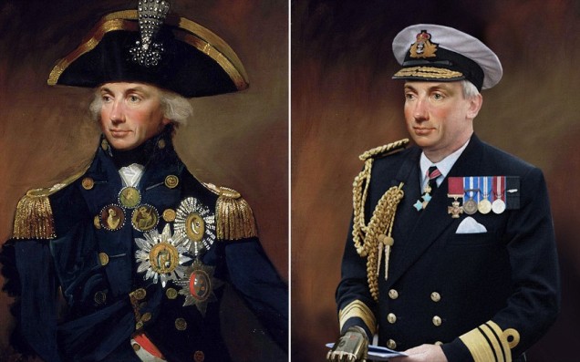
As it turns out, yes. Even in 21st century attire, the character— if not necessarily the identity— of this military officer is still recognizable nonetheless. The above digital painting is from a series of portraits done for the TV show The Secret Life Of… on the channel Yesterday, in an episode where historical figures were given “makeovers”, exploring the idea of how they would look in the year 2013.1 In spite of the drastic shift in physical appearance, most of the featured portraits still managed to effectively communicate the gist of who the figures were. The visual elements were replaced, true, but the new elements that were put in served the same purpose of telling the viewers what the person was all about.
This leads into the driving question for this week’s design challenge: Can a popular fictional character still be recognized even when portrayed in a completely different time, place, and cultural understanding?
Before we try to answer this question however, I’d like to briefly discuss portraiture during the Northern Renaissance, and how it evolved from religious artwork placed on church altars, to private items displayed inside homes.
The Role of Portraiture in Burgundian Netherlandish Life
The Northern Renaissance started in the late 14th century in what was known as the “Burgundian Netherlands” or “Low Countries” (now separately known as The Netherlands and Belgium) when the Dukes of Burgundy amassed wealth through intermarriage with the noble houses of Flanders, resulting in the expansion of their territories.2 The Dukes of Burgundy were dedicated patrons of the arts, understanding that its value lay not just in aesthetics, but also in furthering political agendas. At this point in time, the most highly regarded forms of art were illuminated manuscripts, metalwork and tapestries. By the early 15th century however, Netherlandish artists had developed a new style of painting that involved oil paint on wooden panels, utilizing vibrant colors and intricate details.3 Oil paint was the primary medium of choice of some of the Burgundian Court’s most influential figures, including Jan van Eyck, Petrus Christus, Hans Memling and Gerard David.4
The Court’s high demand for art also led to the creation of specialized artisan organizations known as guilds. These guilds controlled the inflow of commissions in the industry and became a standardized institution whose prestige attracted most of the artists from this period.5 The establishment of guilds thus subsequently caused the art industry to grow and proliferate. Civilians belonging to the middle class became more involved in art patronage as a result, commissioning private works for both religious and decorative use within their own homes.
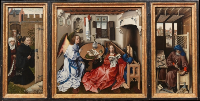
Early Renaissance portraits, both in the North and in Italy, actually started not as portraits in and of themselves, but as parts of religious paintings. Altarpieces, for example, would have the religious figures as the main center of focus, but the patrons who commissioned the work were often included as secondary characters as well. Robert Campin’s Mérode Altarpiece, for example, shows a kneeling man and woman— evidently the clients themselves— alongside religious figures such as the Virgin Mary and the angel Gabriel.
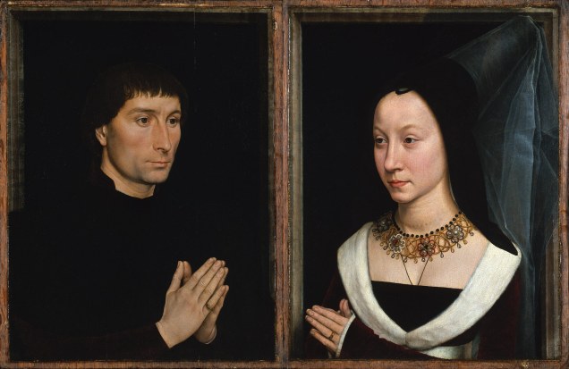
Hans Memling’s paintings of his patrons Tommaso and Maria Portinari, which more closely resemble typical portraits, are also believed to have originally been part of a triptych— a picture on three panels hinged together. Currently, the two figures are placed next to each other, as the two portraits are believed to have been done on the couple’s wedding day. However, some art historians posit that the two paintings possibly flanked an image of a saint originally.6
As more private citizens began to commission art, portraits began to cease merely being background elements of a much larger religious piece. Instead, portraits became separate artworks whose purpose was to memorialize the subject. Portraiture was used to mark an individual’s personal accomplishments and chronicle significant events in their lifetime. This was done by implementing storytelling elements, which could take the form of props neatly arranged in a scene.
An example of this is Jan van Eyck’s double portrait of the Italian merchant Giovanni Arnolfini and his bride at their wedding. In this portrait, it’s quite obvious that a marriage ceremony is taking place. However, by examining the objects in the scene, it is possible to have a deeper understanding of the underlying story. For example, there is the mirror in the background that reflects not just the Arnolfinis, but also the wedding officiator, the painter (van Eyck himself), and possibly an individual meant to represent the viewer. The couple is shown to have removed their shoes— a common interpretation of this act is that marriage is a sacred institution and thus, they are standing on “holy ground”. The small dog on the floor is likewise believed to be a symbol of marital fidelity. The curtains on the bed are drawn back to imply it being “ready for use”, and the headboard is decorated with the image of St Margaret, the patron saint of childbirth. Also, the bride is holding her dress up in such a way that makes her appear pregnant.7

“Painted portraits were an especially popular means of recording likenesses of patrons and, perhaps more than any other genre, demonstrate the abiding interest of Netherlandish artists in precisely rendering the tangible reality of the visible world,” says art historian Jacob Wisse.8 Basically, the artists of the Northern Renaissance helped in the development of naturalistic, lifelike painting which not only preserved the individual’s appearance, but also their story and personality. This set a precedent for the modern idea of portraiture, which was later proliferated and emulated throughout the rest of Europe, and eventually the rest of the Western world.9
Design Problem: Reimagine a Star Wars Character in a Northern Renaissance Portrait

Going back to the question above, this week’s design problem was meant as an exercise for us to “transplant” a fictional character from popular culture into a completely different time period and cultural understanding. In this case, we had to create a Northern Renaissance-style portrait of a character from Star Wars. I was assigned the character of Obi-Wan Kenobi, who serves as the mentor to protagonist Luke Skywalker in the original trilogy, teaching him the ways of the Force even after death.
In the prequel trilogy, Obi-Wan was the former master of Anakin Skywalker before the latter turned to the Dark Side and became Darth Vader. Obi-Wan is an example of the mysterious, wise old man archetype, whose purpose is to teach and guide the hero as he embarks on his journey. He has a calm, patient demeanor and has unwavering faith in the Force. His personality has remained consistent from his days as a young Padawan (Jedi apprentice), and his views and attitude were mostly shaped by his master, Qui-Gon Jinn.

Qui-Gon Jinn, Obi-Wan’s mentor, was a Jedi Master, but not a member of the Council. He was considered to be a “Grey Jedi”— a rogue due to his unorthodox ways. In spite of the stigma, he was nevertheless loyal to the Jedi Order. Qui-Gon was also a believer in the Living Force and was more “spiritual” in comparison to his fellow Jedi Masters on the Council. Because Qui-Gon’s mentorship had such a strong impact on the man Obi-Wan would become, I found it appropriate to include him in the portrait as well as a supporting figure.
The challenge lay in the fact that these two characters are well-known in popular culture. Even people who have never seen the Star Wars movies or know very little of the story at least know that Obi-Wan and Qui-Gon are Jedi Knights due to most people being familiar with the concept and image of a hooded man with a lightsaber.
Would these two characters still be recognizable once we take away the elements associated with them? Would a Jedi still be a Jedi without the trademark brown hooded robes? Would Obi-Wan still be Obi-Wan without his lightsaber? How would one go about portraying a Jedi Knight in the 15th century Burgundian Netherlands? Would the message delivered by the portrait still be the same, or at the very least, analogous with the original?
And thus, we have the Star Wars Northern Renaissance Portrait Project.
Part I – The Paintings of Hugo van der Goes
In order to create a Northern Renaissance double portrait of Obi-Wan and Qui-Gon, I first needed to study and replicate the style of a painter from this time period. I chose to emulate the style and subject matter of the Flemish painter Hugo van der Goes (b. 1440, d. 1482). Van der Goes is best known for religious paintings, from portraits of monks to altarpieces depicting biblical scenes. His most famous work is the Portinari Altarpiece / Portinari Triptych, which was completed circa 1476-1478.
Van der Goes’ personal life greatly affected his work. In 1467, he joined the Painters’ Guild in Ghent, after which he was elected Dean in 1474. In 1477 however, at the height of his career, van der Goes stepped down to become a lay brother at Roode Kloster, a priory near Brussels. He still continued to paint and accept commissions during his time at the monastery.10
Due to his status and credentials, van der Goes was given many privileges even as a lay brother: he was permitted to travel; receive high-ranking guests (including the Emperor Maximilian); and even drink wine.11 He is believed to have suffered from alcoholism and acute depression, culminating in a psychological breakdown and suicide attempt in the late 1470s. Some art historians believe these events had an influence on his final paintings, particularly The Adoration of the Shepherds and Death of the Virgin. The two paintings appear to be straightforward religious pieces at first glance, but upon closer inspection reveal several formalistic mistakes— fragmented pictorial space, chaotic composition, and subpar perspective— mistakes that art analyst Erwin Panofsky says is “a window into the artist’s unstable mind”.12


Despite being mostly known for his biography (and especially his mental illness), Hugo van der Goes was nonetheless an accomplished painter in his own right with a distinct style of his own. Many of van der Goes’ paintings were monumental, with the Portinari Triptych being the largest at almost eight feet in height and ten feet in length. His works also have a large amount of micro-detail for their size, with every texture and minuscule element precisely painted. Van der Goes was particularly adept at rendering human faces which were expressive yet subtle at the same time.13
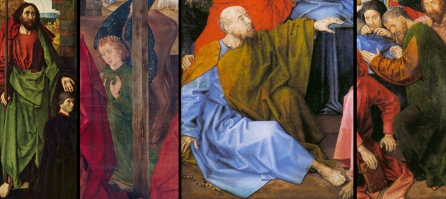
While he was recognized primarily for his religious altarpieces, van der Goes also worked on a handful of portraits during his lifetime. The individuals from these portraits include a Benedictine Monk and two men with their hands clasped in prayer. The first is a seemingly wealthy young man (due to the landscape seen from the window, which could possibly be his territory) and the second is an older man.


The second man, a donor, peculiarly has another figure standing beside him. This figure was not another person present while the donor was being painted, however— he is St John the Baptist, the donor’s patron saint.

The image of the man with St John the Baptist behind him is a particular kind of double portrait from this time period known as a donor portrait, where the subject would be painted alongside the saint from whom they received their name. In these portraits, the donor is usually shown in a stance of prayer, whereas the saint is behind them with a hand on the donor’s shoulder. The purpose of such portraits is believed to be an act of devotion and veneration, where the individual has commissioned the painting to show gratefulness towards the divine figure.14 Again, portraits exist not only to capture the likeness of an individual, but also to tell a story, and donor portraits are another good example of this.
I’ll now proceed with a formal breakdown of the visual elements of Hugo van der Goes’ work. For this breakdown, I’ll be using The Adoration of the Kings from the Monforte Altar. This painting shows the three kings paying respects to the newborn Jesus, with the Virgin Mary and Joseph receiving them. Instead of being in a stable in Bethlehem however, the scene takes place in what appears to be the 15th century Low Countries, as evidenced by the background characters, landscape and architecture. The Adoration of the Kings is a suitable candidate for a formal breakdown because it is a painting representative of the painter’s repertoire that also has— due to the meticulous cleaning and restoration involved— the added benefit of showing us sharper details as well as the artist’s true color palette.

Van der Goes’ work utilizes a combination of curved and angular lines— smooth, curling brush strokes are mostly used on the face, hands and hair, while sharp, straight edges are used for drapery. The brush strokes in the faces and hands are also noticeably lighter and softer compared to the brushwork in the drapery. Likewise, the shapes are also a combination of organic and geometric.
Much like his contemporaries, van der Goes used bright, saturated and compartmentalized colors in his paintings, particularly in the clothing. Interestingly, the brightest, most intense colors appear to have been reserved for holy figures, whereas “regular” individuals are dressed in more understated colors. Also, color temperature is overall warm save for the blues on Mary’s robes and in the clothing of some of the secondary characters.
Value range in Netherlandish paintings at this point in time is mostly inconsistent, and the same holds true for van der Goes’ work. There is never a clear light source in an image— for example, faces can be in a flat light setup where there are barely any cast shadows, whereas the clothing appears to be lit in a strong directional one-light setup. Interestingly, The Adoration of the Kings averts this for the most part, and has a generally unified lighting scheme throughout the painting. There are still some inconsistent shadows here and there however, and bounced light does not exist.
The texture is partially glossy due to the process in which oil paint is built up in thin, transparent glazes (layers).15 As a result, some areas are also thicker and more pronounced than others due to having more layers of paint on them. There is also slight roughness on the surface in areas where the paint has cracked.
Lastly, there is the use of space. Northern Renaissance paintings tend to include many visual elements in the scene, either for narrative purposes or simply to fill up blank areas on the canvas. Van der Goes follows this tradition, and it can be seen in the far left and topmost corners of the painting, where scenes of daily rural life are shown but have almost nothing to do with the three kings visiting the infant Jesus.
Now that we have an understanding of Hugo van der Goes, his subject matter and painting style, we can then proceed to actually applying this information to the two Star Wars characters and re-envision them as characters in a 15th century Netherlandish portrait.
Part II – The Star Wars Northern Renaissance Portrait
Subject Matter and Context
I envisioned Obi-Wan as a former knight turned ascetic or monk, drawing from his canon backstory in the events between Revenge of the Sith (Episode III) and A New Hope (Episode IV), where he becomes one of the last Jedi Knights following the destruction of the Order and becomes a wanderer. Appropriately enough, this also mirrors van der Goes’ own personal experience. Whereas I used asceticism as an analogue to Obi-Wan’s new nomadic life, I also used a knightly order as an analogue to the Jedi Order. Knights did in fact exist in the Burgundian Netherlands during the Northern Renaissance— often these individuals were from noble houses descended from Crusaders, and many Netherlandish knights during this period were affiliated with The Order of the Teutonic Knights of St. Mary’s Hospital in Jerusalem, or the Teutonic Knights for short.16
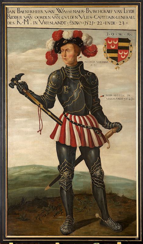
Upon further research I learned that other Netherlandish knights belonged to Roman Catholic chivalric organizations such as the Order of the Golden Fleece.17 One of the order’s most famous members was Jan II van Wassanaer, High Commander of Friesland (Frisia), a province in the northwest of the Netherlands, situated west of Groningen, northwest of Drenthe and Overijssel. Jan II, also known as “Jan with the Jaw” because of the prominent scar on his left jaw and cheek, is regarded as both a folk hero and a cautionary tale in the province of Friesland due to his brave yet reckless nature, which caused him both many victories as well as humiliations.18 Interestingly, Jan II’s personality is very similar to that of Anakin Skywalker, Obi-Wan’s former apprentice who turned to the Dark Side and became Darth Vader. I took note of this and decided to include some aspect of this backstory as an element in my portrait as well.

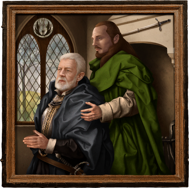
While Obi-Wan Kenobi is the main focus of the portrait, I also had to include Qui-Gon Jinn. I chose to do a donor portrait for my composition in order to show Obi-Wan as the central figure, with Qui-Gon serving the role of his “patron saint”. I found this fitting since, as mentioned previously, much of Obi-Wan’s personality and beliefs were shaped by his master’s teachings. It was only appropriate that Qui-Gon be also included in a commissioned painting as an act of devotion by the “donor”.
Composition
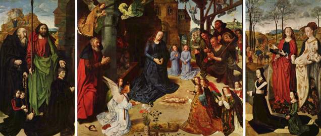
Because I chose to do a donor portrait, I needed to consider the kind of composition I would use. Portraits that include both the donor and their patron saint often have the latter emphasized in some way in order to show their divinity. This emphasis is usually accomplished by having the patron saint be much taller. For example, in the Portinari Triptych, Tomasso Portinari’s patron saint, St Thomas, is portrayed as being significantly larger than him. St Thomas is also in the center of the composition and is garbed in bright green and orange robes of biblical origin, making him stand out from the rest of the image.

However, I could not directly reference the above image for my composition, as the Portinari Triptych is a religious altarpiece and not a private portrait. Furthermore, I had to take the relationship of the two figures in the composition into account. While it was important to show Qui-Gon and show him in such a way that it would be obvious that he was acting as the patron saint, I had to ensure that Obi-Wan would still be the main focus of the picture. I then came across two more double portraits of a donor and his patron saint: the first is of Etienne Chevalier by Jean Fouquet; the second is of an unnamed man and St Maurice (or possibly St Victor) by Jean Hey (formerly known as the Master of Moulins).


I found these two paintings appropriate because they portray the donor and the patron saint in such a way that neither of which is overpowering the other in terms of focus. Both St Stephen and St Maurice are emphasized by being physically larger than the client, but unlike St Thomas, do not dominate the composition. Incidentally, Jean Hey also happened to be Hugo van der Goes’ only known apprentice.19 To me, this meant that the image was stylistically close enough to my chosen painter that I could also use it as a reference.
Production

Following my source material, I drew Obi-Wan in a pose of supplication with a taller Qui-Gon standing beside him with a hand on his shoulder. I derived Obi-Wan’s tableau from that of Joseph’s in The Adoration of the Shepherds, but tilted his head upwards. I also derived the robes directly from what Joseph wears in the painting due to the simplicity and practicality of the design. Qui-Gon’s pose is also partially derived from Joseph’s stance in The Adoration of the Kings, with his head in profile view like St Stephen from the Melun Diptych.

One significant change I made to Obi-Wan’s attire is to garb him in blue rather than the usual Jedi brown robes. This was done in order to emphasize the character more and keep with the style in my source material, although I did diverge slightly by having Obi-Wan’s robes be a darker, less saturated (almost grey) blue. I did this because in van der Goes’ works, the bright, intense colors are typically reserved for divine figures while darker, more understated colors are given to regular human beings. Blue seemed an appropriate color choice because it is often associated with traits like “calmness”, “intellectualism”, and “passivity”20— all of which are applicable to Obi-Wan. Historically, blue was also used to evoke heavenliness and divinity, as evidenced by countless images of the Virgin Mary garbed in blue. Because Obi-Wan himself becomes a Force Ghost at the hands of Darth Vader towards the end of A New Hope, I find this quite fitting.
I also picked the color blue for a more prosaic reason: Obi-Wan’s lightsaber and Force Ghost are blue.
Likewise, I chose the color green for Qui-Gon due to it being associated with traits such as “balance” and “harmony”.21 Again, these traits are all applicable to Qui-Gon due to his beliefs and his nature as a Grey Jedi who is still loyal to the Order despite their ostracizing of him. Green also appears to be a commonly used color for divine figures, at least in Hugo van der Goes’ repertoire, as he has used the color for St Thomas in the Portinari Triptych, an angel in The Adoration of the Shepherds, and two Apostles in Death of the Virgin.
And as with Obi-Wan, there is another, more simple reason for my choice of garbing Qui-Gon in green: the color of his lightsaber.
Moving on to the storytelling aspect of the portrait, I considered which details I wanted to include. I sought to portray Obi-Wan in such a way that it was evident that while he was no longer affiliated with his knightly order, he still deeply follows the code of chivalry. In order to show this, I opened up his robe slightly, making the armor he wears underneath visible. The armor itself is period-appropriate with the plate’s edges decoratively cut with Gothic tracery.22 His knight’s bastard sword— a stand-in for the lightsaber— is visibly hanging off the belt on his waist. Bastard swords have an extended, bottle-necked handle that allowed the sword to be gripped in “a hand and a half” 23 and also had more ornate hilts. This gave me an opportunity to decorate the hilt and handle of Obi-Wan’s sword with sapphires, alluding to the Kyber Crystals used to power lightsabers.24
In my initial sketch, I also had Obi-Wan wear a Teutonic Order-style pendant with the Jedi Order symbol on it instead, but once I had begun to paint in the details of his armor, I realized the pendant would be barely visible. I wanted to keep the Jedi Order symbol somewhere more prominent in the painting, and eventually I decided to include it on the window as a decoration, similar to the coat of arms seen in the window of Hans Memling’s portrait of Maarten van Nieuwenhove.

Creating the actual painting in Photoshop was fairly straightforward, as I am quite adept with the software due to my concept art background. After creating the necessary changes to my sketch (such as changing the composition to a square frame and including an environment), I painted over it. While 90% of my donor portrait is digitally painted by hand, I also added some photographic elements in places where I found them necessary, such as the armor and swords. I then painted over the photos again so as not to detract the viewer.
Because I tend to work in as few Photoshop layers as possible, I started by painting the background first. I started with a layer of flat colors to block in the forms, then gradually painted in values and detail. I lifted the design of the fireplace as well as the landscape seen through the window from Robert Campin’s Annunciation painting and a detail from Hugo van der Goes’ Portinari Triptych, respectively. For the window and fireplace grate, I looked at reference photos while painting the objects.
There is a second bastard sword in the environment, displayed above the fireplace. This is a little Easter Egg I included, alluding to Anakin Skywalker’s lightsaber, which Obi-Wan took after defeating his former apprentice at the Battle of Mustafar and eventually gave to Anakin’s son Luke Skywalker. The way I positioned the sword is also deliberate in that it is pointed towards Qui-Gon, hinting at his death by lightsaber at the hands of Darth Maul.
Once I had finished painting the environment, I proceeded to paint the two central figures. Obi-Wan and Qui-Gon were in separate, masked layers so I could paint them without affecting my background underneath. I also had a reference layer with photos of Sir Alec Guiness as Obi-Wan and Liam Neeson as Qui-Gon, which I used as a guide while painting their faces. In keeping with Hugo van der Goes’ style, I deliberately made the lighting scheme for the faces and hands different from the lighting scheme for the drapery and armor, as well as the overall lighting for the room the two figures are in. I made sure to keep the lines in the drapery as crisp and sharp as possible, while minimizing the amount of contrast and shadows in the faces.
Once I had finished painting the figures, I then created another “paintover” layer where I did some additional painting to blend the background and foreground elements together, eliminating any sharp edges or artifacts that might give the painting a “digital” look. I also painted in “noise” elements to emulate the texture of the wooden panel, as well as paint cracks in some areas. And for added authenticity, I also included a wooden frame border.
The very last thing I needed to do was to give my donor portrait a title. The name “Obi-Wan Kenobi” does not at all sound like a Netherlandish name, so instead, I found a substitute that was conveniently similar: the Frisian name “Obe-Wandert”. As for Qui-Gon, I chose to retain his name as I found that saints in Northern Renaissance portraiture typically do not have their names translated.
And finally, here is the end result.
This blog post was made possible by the translation skills of Valerie E. Lutke of Lutke Language Link!
NOTES:
- “How historical figures would have looked today”, The Telegraph, accessed November 9, 2017, http://www.telegraph.co.uk/culture/culturepicturegalleries/10030619/Historical-Figures-for-the-21st-Century.html.
- Fred S. Kleiner and Christin J. Mamiya. Gardner’s Art Through the Ages: Twelfth Edition (Belmont: Wadsworth/Thomson Learning, 2005), 548.
- “Low Countries, 1400-1600 A.D.”, The Metropolitan Museum of Art Heilbrunn Timeline of Art History, accessed October 21, 2017, https://www.metmuseum.org/toah/ht/08/euwl.html.
- Jacob Wisse, “Burgunian Netherlands: Court Life and Patronage”, The Metropolitan Museum of Art Heilbrunn Timeline of Art History, accessed October 21, 2017, https://www.metmuseum.org/toah/hd/bnpu/hd_bnpu.htm.
- Kleiner and Mamiya, Gardner’s Art Through the Ages, 556.
- Jean Sorabella, “Portraiture in Renaissance and Baroque Europe”, The Metropolitan Museum of Art Heilbrunn Timeline of Art History, accessed October 21, 2017, https://www.metmuseum.org/toah/hd/port/hd_port.htm.
- Richard Howells, Visual Culture (Malden: Blackwell Publishers Inc., 2003), 19-21.
- Jacob Wisse, “Burgunian Netherlands: Private Life”, The Metropolitan Museum of Art Heilbrunn Timeline of Art History, accessed October 21, 2017, https://www.metmuseum.org/toah/hd/bnpr/hd_bnpr.htm.
- Maryan W. Ainsworth, “Early Netherlandish Painting”, The Metropolitan Museum of Art Heilbrunn Timeline of Art History, accessed October 21, 2017, https://www.metmuseum.org/toah/hd/enet/hd_enet.htm.
- Till-Horger Borchert, “Biography: Hugo van der Goes”, Flemish Primitives, accessed October 27, 2017, http://vlaamseprimitieven.vlaamsekunstcollectie.be/en/biographies/hugo-van-der-goes.
- Peter Murray and Linda Murray, The Art of the Renaissance (New York: Thames and Hudson Ltd, 1963), 159-160.
- Jessica Buskirk, “Hugo van der Goes’s Adoration of the Shepherds: Between Ascetic Idealism and Urban Networks in Late Medieval Flanders,” Journal of Historians of Netherlandish Art 6:1 (Winter 2014) DOI: 10.5092/jhna.2014.6.1.1
- Murray and Murray, The Art of the Renaissance, 160.
- Kleiner and Mamiya, Gardner’s Art Through the Ages, 565.
- Susan Jones, “Painting in Oil in the Low Countries and its Spread to Southern Europe”, The Metropolitan Museum of Art Heilbrunn Timeline of Art History, accessed October 21, 2017, https://www.metmuseum.org/toah/hd/optg/hd_optg.htm.
- “Members of The Order of the Teutonic Knights of St. Mary’s Hospital in Jerusalem”, accessed October 24, 2017, http://www.imperialteutonicorder.com/id67.html.
- “Order of the Golden Fleece”, accessed November 1, 2017, http://www.thefleece.org/order.html.
- “Ridder Jan met de Kaak” (Knight Jan with the Jaw”), Volksverhalen Almanak (“Folk Almanac”), accessed October 18, 2017, https://www.beleven.org/verhaal/ridder_jan_met_de_kaak.
- Murray and Murray, The Art of the Renaissance, 169-171.
- Angela Wright, “Psychological Properties of Colours”, Colour Affects, accessed October 23, 2017, http://www.colour-affects.co.uk/psychological-properties-of-colours.
- Ibid.
- Dirk H. Breiding, “Arms and Armor in Renaissance Europe”, The Metropolitan Museum of Art Heilbrunn Timeline of Art History, accessed October 26, 2017, https://www.metmuseum.org/toah/hd/rarm/hd_rarm.htm.
- “Bastard Sword”, Medieval Life and Times, accessed November 10, 2017, http://www.medieval-life-and-times.info/medieval-swords-and-armor/bastard-sword.htm.
- “Kyber Crystal”, Star Wars.com, accessed November 10, 2017, http://www.starwars.com/databank/lightsaber-crystal.
